Watercolor Tutorial
A basic watercolor kit might include:
|
2 inch wide Japanese Hake brush.
An inexpensive brush that is great for large washes.
3 inch paint brush for brushing eraser crumbs from your paper. A natural sponge is best, but regular sponges are less expensive and work fine. Rags, paper towels are okay, old cotton "T" shirts are better, but cotton baby diapers are the best! Water jars, used pickle jars are okay, keep the lids. Eye droppers, I prefer drug store syringes. Throw away the plungers and hold a finger over the opening to transfer water to cakes or trays. Watercolor trays, I like porcelain, round or rectangular. Plastic trays work fine, but I find them too light. Gummed paper tape, a roll of 2 inch or 3 inches wide. Needed only if you plan to stretch your paper. 24 in. x 30 in. watercolor board. Useful if you're planning to stretch your paper or work out of doors. Pencils, a no. 2 pencil works fine. I prefer mechanical pencils with 5mm, 2H leads. Ebony pencils, HB, and B pencils may be too soft but, 2B, 4B, 2H, and 4H being harder work better with watercolor. By the way. Pencil lead softness and hardness is designated by number and letter codes stamped at the end of the pencil. "H" designates hard lead, while "B" designates soft lead. The larger the number the harder or softer the lead. Hence, 6H designates a very very hard lead, while 6B designates a very very soft lead. An Ebony pencil is a very soft lead pencil with a thick lead. Erasers, I prefer gum erasers as they are soft and won't damage your paper, but Pink Pearlor white plastic easers are okay. Pencil sharpener Single edge razor blades, Optional 18 in. metal ruler, Optional Thumb tacks or push pins, Optional 3/4 inch masking tape, Optional XActo knife, Optional Tape measure, Optional Pocket knife, Optional Maskit and a pickup, Maskit is liquid latex and is used as a liquid stencil. I apply it with an "old" brush or splatter it with a toothbrush. Prior to dipping a brush into the maskit bottle, I find it good idea to liberally wet the bristles of the brush with bar soap and wipe the excess soap off. This helps protect the bristles from dried maskit. After the maskit dries on the painting, paint directly over it. Remove it with the pickup, a sort of eraser. Optional Toothbrush, To splatter or not to splatter. Optional Sunglasses, Working out doors on a bright sunny day you can go snow blind staring at a piece of white watercolor paper. Hat, Sun stroke protection Sun block...Tan, don't burn |
It is a good idea not to purchase expensive tools or materials right away. On the other hand don't purchase the cheapest materials either or you may have difficultly learning the medium. Become familiar with some of the materials and techniques before purchasing more expensive items such as brushes and paper.
Watercolor Brushes
A basic set of watercolor brushes
Do not purchase expensive brushes right away, but definetely do not purchase the cheapest brushes either. Watercolor brushes that come with inexpensive watercolor kits are most often useless and will often frustrate a beginning watercolorist. I suggest tossing them.
Watercolor brushes come in many brands, shapes, and sizes. Be careful you purchase watercolor brushes! It can be easy to get them confused with oil or acrylic brushes. Watercolor brushes have shorter handles than oil and acrylic brushes and the bristles are generally softer. If you are not sure what to look for, ask your art store professional for assistance, and select brushes only from displays labeled as watercolor.
Watercolor brushes, most commonly rounds sized under 1/2 inch are designated by numbers ranging from 000 to 20, though I have a brush labeled as 0/3 which is slightly smaller than a 000. Flat brushes may be sized by number but most commonly are sized in increments of inches especially if over 1/2 inch. Number sizes may vary from one brand to another. Brushes are made with natural or synthetic fibers. Synthetic fiber brushes work very well but they don't hold as much water and pigment as natural fiber brushes. This can be good. I have a no. 8 round that is a blend of synthetic and natural fibers. I suppose it holds more water than a synthetic fiber brush, but less water than a natural fiber brush. Synthetic fiber brushes are generally slightly stiffer than natural fiber brushes.
As a beginner one does not need a wide assortment of brushes. Over the years I've collected a number of brushes of various sizes and shapes, but find I normally use only a few. My workhorse brush is a Kolinsky red sable no. 6, round. Kolinsky, Red sable brushes are considered the best, and can be very expensive. I sometimes use a no. 18 (3/4 inch) cat's tongue brush. A cat's tongue is a wide flat brush that narrows to a fine point. Hence cat's tongue. I like this brush because I can paint large washes with it and still use it to get into tight corners. Another brush I like is a no. 8 synthetic round. I use it mostly for mixing pigments and testing washes. It's similar to the Kolinsky only a little larger and made from synthetic fibers.
I recently purchased a number 10, Kolinsky round mop which I find I like a lot. A "mop" is usually a natural fiber brush that holds a large amount of pigment compared to other brushes, and is used to lay down or pick up large amounts of pigment and water. Hence "mop".
As brand names go, Winsor & Newton, Richeson, and Utrecht are good beginner brushes. Cotman is made by Winsor & Newton and is their student grade brush.
I suggest that beginners purchase a no. 6 or 8 round and maybe a no. 12 round, plus a cheapo 2 inch wide ”Hake“ japanese brush for wide washes. Those are all you need to get started. As you progress with watercolors you will no doubtedly try, use, and appreciate other brushes.
Watercolor Pigments
A basic set of pigments:
Watercolor starter kits are available at almost every art retail outlet. They will have the basic pigments and colors in tubes or cakes. I suggest beginning with cakes. They are less expensive and less wasteful and come with a useful easily managed selection of colors. You may also wish to buy a couple of tubes to see what they are like. Buy small tubes at first. I suggest better quality pigments from the beginning. Cheap pigments usually contain much more gum arabic as the paint medium and can end up costing more than better quality pigments. They also don't give the intensity of color that good pigments will.
A few brand names are Winsor & Newton, Holbein, Old Holland, Van Gogh, Cotman, and M. Graham. Cotman as noted elsewhere is Winsor & Newton’s student grade pigment. I've had good luck with all of these though color quality varies between brands. My favorite choice is M. Graham. I also have personal preferences of some pigments over others non-dependant on quality, but rather on brightness, hue, or intensity of color.
All paints use a binder or medium to suspend the colored pigment. Gum arabic is most commonly used as the binder for watercolors.
Suggested colors:
Lemon yellow, cadmium yellow deep, yellow ochre, raw umber, sepia, cadmium red, alizarin crimson, permanent green, emerald green, cobalt blue, ultramarine blue, Prussian blue, Paynes grey.
Every starter kit, either cake or tube will come with white. I suggest not using white right away. White is an opaque pigment and is used most often toward the completion of paintings as added highlights. Some strict watercolor purists will contend that white not be used at all. All pigments vary in opacity. Some specialized colors have white in them. I stay away from these as I can add my own white if I like. Pigments with white added are noticable by their paleness or tint and opaqueness.
I'm not fond of using black in watercolor painting, but ivory black would be okay if you feel so inclined.
All colors are fugitive to some degree. It doesn't matter if they're oil or water based. Oil paints are less fugitive because the oil diffuses ultraviolet light to some degree. All commercial pigments are standardized and tested as to the amount they fade from being exposed to ultra violet light over specific periods of time. All tube paints are labeled as to how resistant they are to light. Warm colors such as crimson can be more fugative to light than cool colors. An example of ultra violet light damage are posters you may have seen in store front windows. The warm colors such as the reds and yellows have totally faded and what are left are the cool blues. It is an issue to be aware of, but don't let it stop you from using colors you feel give the aesthetic qualities you desire in your work.
Watercolor Paper
The right kind of paper is very important.
I strongly encourage developing discerning tastes and aesthetic opinions concerning paper. There are all kinds of paper, and art papers are extremely interesting and varied. Take some time to look at various kinds and brands of paper. Consider not only what papers are best for your needs, but also what papers you like or dislike. When looking at paper, observe its texture, smoothness, weight, color, feel, and look. Really look at it and get a feel for it. As you work with watercolor papers you will develop your own personal azesthetics about paper. You'll learn which papers work for you and which don't. Get picky! Enjoy and experience paper as an art form unto itself. Handmade papers can be beautiful and very rewarding to look at and appreciate.
Watercolor paper comes in all kinds of sizes, weights, designations, colors, and textures. Watercolor paper can be machine made or it can be hand made. The best and also the most expensive watercolor papers are custom hand made. Watercolor paper comes in sheets, pads, blocks, reams, rolls, and boards. It can be imported and it can be domestic. It can be dirt cheap and it can be very, very expensive.
Watercolor paper is designated by its thickness or weight. Common weights are 60 lb., 80 lb., 140 lb., 150 lb., 200 lb., 300 lb., 600 lb., and 1200 lb. A paper's weight refers to the weight of a ream of paper which consists of 500 sheets. Hence, if 500 sheets weigh 150 lb. then 1 sheet of that brand will be designated as being 150 lb. paper. I recommend using paper with a weight of no less than 140 lb. More substantial weights of paper over 200 lb. wrinkle less than lighter weights and usually don't require stretching.
The best watercolor paper is "all cotton" and "acid free". One should only purchase all rag cotton, acid free paper. Paper with a PH balance of 7 is best. The exception being rice paper which should still have a neutral PH balance, meaning it is acid free. Cheap paper of lesser weight in pads may not be acid free and may not be all cotton. The cover of the pad might show wether it is or isn't. If it doesn't say, it most likely isn’t.
Watercolor paper is described as either "machine made" or "handmade". Handmade paper has more texture and is less uniform than machine made paper. It is also designated as being either cold-pressed or hot-pressed. Cold pressed paper tends to have more texture. Some cold press papers may be described as "rough". Texture and designation of texture of cold press paper varies between weights and brand name. There is little standardization in the manufacture of papers though. Textures and weights will vary depending on the brand. It's best to experiment and learn what's out there, what you like, and what you can afford.
Watercolor paper found in better art stores and supply houses is often sold in single sheets which vary in size. A common size is 20 in. by 30 in. This size, 150 lb. cold press may cost somewhere around 2 or 3 dollors. I find it less expensive to purchase this size paper and rip it to smaller sizes rather than purchase small sheets.
Watercolor paper is sold in "blocks" as well. A block of paper consists normally of 20 sheets of paper bound at the edges by gum and backed by a thick dense piece of cardboard. The sheets are separated from the block either before or after painting on them by slipping a knife (or long finger nail) between the first and second sheets at the top edge of the block, and sliding it along the edges, cutting the gum. Blocks are very stiff and are great for taking out of doors to paint on. Better, I think than taking a watercolor board for the same purpose. Arches offers blocks of hot and cold press paper in several sizes. These can be expensive, but I often find them on sale, or wait to purchase them until they are.
I used to purchase Arches 150 lb. cold press paper in rolls. It came 44 inches wide by 30 yards in length, if I remember correctly, and was great as I was making 5 foot long watercolor paintings at the time. Needless to say, even at 5 feet per painting, the rolls lasted a while.
If one is so inclined, one can purchase small pads of 150 lb. cold press paper in pads the size of postcards. These are really great! The sheets are printed on the back postcard style and are wonderful for making watercolor postcards to send to friends and family while traveling.
Hand made paper and better machine made paper will have a watermark in a lower front corner of the paper. The watermark is the maker's brand and should be readable from the front. Watercolor paper does have a top side and a bottom. Paint on the top as it has more sizing and will accept pimgments better. The top is determined by finding the watermark and reading it. The watermark is readable from the front of the paper and not the back. Another, though more difficult method to determine the bottom of the paper is to turn the paper over and look for a slight grid pattern. This pattern is made by the screen that the paper is dried on top of.
Your Studio
The right work environment (your Studio) is very important.
Your "studio" can be anything from a table and chair in the corner of your bedroom, a kitchen table, an easel planted on a side street, or a loft space with skylights and leaky roof. I've had these and others and now use a bedroom made into a studio in which I have two large tables and an eighteen by thirty inch plywood easel set at a slight angle. I've found that good lighting, room to work unemcombered, and comfort are very important. A room with north light is not to be sneezed at. My "studio" has two windows that face east and north. During morning hours the sun would shine in my face, so I now sit with a table at the north window where the daylight is always even.
Chairs with back good support for long periods of sitting are very important! A table should be large enough to hold your largest paper size plus room to hold brush holders (jars), pigments, pigment trays, water jars, and lights with room to spare for elbow room and odds and ends that accumulate. Consider the subjects you're painting, or are painting from. Do these reqire separate space or do they sit on your table as well? As an example, my paintings average 14 x 40 in. My table is 32 in. deep and 80 in. long and I use just about every square inch. I suppose if it were larger I would use all of it too. By the way, it is made from a hollow core door I purchased a local lumber yard. The legs are 1 x 2's with a pair of wheels under two of the end legs. It's sturdy and rolls around very easily.
You may prefer to paint on an easel. Keep in mind that you will still need a table or some flat surface to hold your stuff. Wall shelving of some kind is always useful.
Good lighting is of primary importance. It's true what they say about north light. It's even and it's natural. If that's not possible you should use lighting that will best illuminate your work area. Incandescent light is much better than one. Try to place the lights to reduce shadow and glare. Color corrected incandescent bulbs are great and show the true color of your pigments.
You'll need a place to hold your paper and your finished paintings. This may not be a priority at first, but will become apparent as time progresses. All paper should be stored flat. This includes all finished work. Flat files are best if you have room. Baring that, portfolios can be handy both spatially and economically. It's a good idea to store all your unmatted work sandwiched between sheets of archival tissue paper for protection.
Painting outdoors can be very rewarding. It may seem daunting making art in public, but after a few outings it becomes second nature. Dress for the weather! Wear a hat, use sun screen, and take plenty of water along for your self as well as for your painting. Wear a good pair of sunglasses to reduce glare from your paper, and if possible Work in the Shade!
Getting Started
You now have everything you need to begin painting, but first...
You should consider the size of the paper you wish to use. If it's not too large or to heavy in weight you should rip it to size so as to retain or give it deckled edges on all four sides. Don't cut it to size with a pair of scissors or an xacto knife! Watercolor paintings should have deckled edges whether they are matted or not. It's an aesthetic thing.
The best method I know for ripping paper to make deckled edges is to take a metal straight edge or steel ruler and lay it along a drawn line at the rip. The surface you're working on should be flat. Grasp the tear off side of the paper with your right hand at the farthest corner away from you on the right side of the paper. Gently lift and pull the paper up and slightly into the straight edge. Be sure to put a lot of pressure with your left hand onto the straight edge so it lays flat and doesn't move. It should act as a stationary cutting edge. You should adjust the grip of your right hand as you pull the paper toward you by progressively grasping it's edge at spots closer to you as the rip progresses. At the same time keep placing and applying pressure with your left hand close to the edge of the rip as it progresses toward you along the straight edge. Do this until you reach the end of the paper and the to two pieces separate. Persons who are left handed should grasp the left corned furthest away from them with their left hand and use their right hand to hold the straight edge.
Next...
Consider whether or not you're going to stretch your paper. Stretched paper reduces warping and wrinkles, especially if it is 150lb. weight or less. To stretch paper you will need a wide flat board to stretch and adhere the paper. Use Kraft tape to adhere the paper. Kraft tape comes in rolls, is brown like Kraft paper, and has water activated gum adhesive on one side. The adhesive must be moistened with water. The board should be larger than the paper by several inches on four sides. Some art stores carry these boards, or you can purchase pre-cut pieces of 3/8 in. or 1/2 in. birch plywood at a local home store or lumber yard. Be sure you varnish or paint the plywood to seal it from water. An egg shell or gloss white paint works well.
Again, consider the dimensions of the painting. A white border around the eges of the paper isn't necessary, it's an aesthetic decision, but a border is useful if the work is to be matted. Remember too, that there must be space around the four edges of the paper to accomocate the adhesive paper tape. Enough space for the tape to adhere well to, say at least 1/2 inch if not more.
With your paper and materials ready, dip and submerge your paper into a clean sink or tub of cool clean water. Don't use hot water as it may disolve the sizing on the paper. Soak it for 10 to 20 minutes, depending on its weight. A light weight paper will need to soak less than a heavier weight paper. When ready, lift the paper out of the water suspending it by one corner over the sink or tray to drain away excess water. Center the paper on the board and moisten 4 strips of pre-cut gummed tape that are cut slighly longer than the longest side of the paper. Moisten one tape strip at a time with a wet sponge just prior to laying each piece over the edge of the paper, adhesive side down covering least 1/2 inch of the paper. Try not to over moisten the tape. One pass of a wet sponge over the gummed side of the tape is enough. Too much moistening will dilute the adhesive and it will not adhere well to the paper. Adhere one edge of the paper to the board, then adhere the side opposite to it. Next, adhere another edge of the paper, and after that adhere the last edge. Lightly wipe across the surface of the paper with a damp sponge to remove excess water, and ensure that the tape is adhering well to the paper and the board.
As the paper dries it will shrink and become taut. Drying times will vary depending on the humidity and the weight of the paper. When dry, the paper will be taut and ready for painting. Don't remove the painting from the board until the painting is completed.
When completed the painting must be removed from the board by cutting away the kraft tape at the edge of the paper. Some people leave the tape on the painting. I don't care for this practice, but it is acceptable if the work is to be matted. Flat head tacks may also be used to stretch paper, but I think it easier to use paper tape. The advantage to using tacks is there is no adhesive paper tape to cut away or leave on the painting.
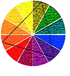
Color Theory
A basic understanding of color theory is very important.
It is very important to keep in mind that watercolor pigments are transparent. Watercolors that use the transparency of the pigments are more interesting in their use of color and texture. One blends color in watercolor painting by 1. Mixing two or more pigments with water in a pallet. 2. By applying washes into wet washes on paper (wet on wet). Or 3. by applying washes over dry washes on paper (wet on dry). One can achieve what are termed brighter colors by applying washes over dry washes instead of mixing two wet pigments either in a pallet or on paper. Wet washes applied over dry washes do not mix mechanically as they would if they were mixed wet into wet, so each wash retains some of its individual hue or color. A third color is still the result, but our eyes mix the two colors much like looking through two pieces of colored glass. An example would be a light blue pigment washed over a dry yellow pigment. The resultant color that one would percieve would be green.
Color Theory
This brings us to the importance of color theory and how colors blend. But, first let us look up
color wheel and then look at an example of a simple twelve section color wheel.
Primary colors
Red,
yellow, and
blue
are the primary colors. Primary colors are often depicted on a color wheel. Theoretically, it is possible to make all colors by blending these three hues.
Secondary colors
Secondary colors are orange,
violet and
green.
Secondary colors are made by blending primary colors.
Blend red and yellow and the result is orange.
Blend red and blue and the result is violet.
Blend blue and yellow and the result is green.
Analogous colors
Colors that are next to each other on the color wheel and
are closely related. For example, blue, blue-green, and
green all have the color blue in common. Families of
analogous colors include the warm colors (red, orange and
yellow) and the cool colors (green, blue and violet).
Analogous colors are sometimes referred to as adjacent
colors.
Complementary colors
Colors that are directly opposite each other on the color wheel, such as red and green, blue and orange, and violet and yellow. When complements are layered or mixed they can form neutral hues or colors that appear "neutral" or grayish in nature.
Split complements
One color plus the two colors that are on either side of its complement on the color wheel. For example, the complement of orange is blue, and the two colors on either side of blue are blue-green and blue-violet. Therefore the split complements of orange are blue-green and blue-violet.
Harmonious Colors
Harmonious colors look good together because they are complementary colors, analogous colors, or otherwise related.
Harmonic Triads
Place an equilateral or isosceles triangle in the center of the color wheel, the 3 colors touched by at the corners are known as triadic colors. These color combinations create a harmonious color theme. They are lively and contrasting, and provide the strongest contrast in terms of hue. All pure undiluted colors contrast.
Value Key
The relative level of a color's value, whether referencing an individual color, or a color scheme seen either in an artwork's entirety or in a passage within one. The lighter the value, the higher and more cheerful the value key; the darker the value, the lower and more somber the value key. See also chroma key.
Linear Perspective
Foreshortening and linear perspective are good for painters to know and understand.
Simply put, foreshortening means that an object or parts of an object that are closer to us appear larger than objects or parts of objects that are further in the distance.
Linear perspective is the representation of height, width, and depth on a flat surface such as paper. Using one-point and two-point perspective, one can render objects so they appear 3 dimensional.
The Florentine sculptor and architect Filippo Brunelleschi is credited with developing one-point perspective early in the 15th century.
|
Below, is a picture of the painting, Christo Morto nel Sepolcro e Tre Dolenti by Andrea Mantegna. It's in the Brera Museum (Pinacoteca di Brera) in Milan, Italy. In this painting of Christ we see that Senor Montegna used artistic liscense and rendered foreshortening in the reverse. Rendered correctly, Christ's feet would appear much larger because they are in the foreground and his head much would appear much smaller because it is in the background and further in the distance. 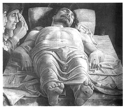
|
|
The following altered version of the work may be more correct in showing foreshortening. The feet are larger and the head smaller as would be seen in proper foreshortening. Still, I think I prefer Senore Mantegna's original version. 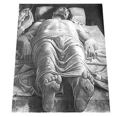
|
Watercolor Technique
It's time to paint!
Have a container of clean water, paper, brushes, and pigments ready. You should have a cotton rag or paper towel handy as well, plus a scrap piece of watercolor paper on which to test the pigments you're about to use before you apply them to your painting.
First practice making washes.
Watercolor painting involves using washes of one kind or another more than any other technique. The two most common washes are termed "wet in wet" and"wet on dry". Wet in wet simply means painting on an already wet surface of paper. Wet on dry means painting on paper that is not wet. It's dry! Like applying a loaded brush to dry paper, or calligraphy, or using dry brush techniques. Keep in mind that you can adjust the amount of dampness or wetness of the paper. You can even add water after painting with pigments. Bear in mind also that a wash can be any size, from covering the entire paper to painting a small detail like a button on a shirt.
Let's begin with a relatively simple excersize. A one color wet in wet uniform flat wash. A flat wash is a wash that doesn't vary in hue or value. It's uniform over the entire range of the wash. Theoretically the ratio of pigment to water remains consistent while applying the wash.
Grab, cut, or rip an 8 x 6 inch piece of 140 lb. or 150 lb. cold pressed paper. Lightly, draw a pencil border on the paper about an inch from each edge. Use a straight edge or you can free hand it. An easy and fast method to freehand a pencil border is to use your index finger as a guide against the edges of the paper. Freehanding a Pencil Border Demo. Hold the pencil between your index finger and thumb, thusly.
Prepare enough pigment for the wash, let's say cobalt blue. I like using white porcelin trays to mix the pigment and water together. I begin with a few drops of water from an eyedropper in the deep end of one of the tray reservoirs. A few drops of water on the cobalt blue cake will dissolve enough pigment to pick up with a brush. Charge your brush with pigment from the cake and deposit it in the shallow end of the same tray reservoir. Mix the pigment and water together until you have enough to make a light blue wash. Remember that pigments look lighter in value when dry. With practice you'll quickly learn how much pigment and water to use. Squeeze just a little dab into the shallow end of the reservoir if you are using tube pigments, and mix it into the water until disolved.
Wet the paper with a 1 inch flat brush, a cats tongue brush, or a 1 or 2 inch wide Japanese brush. Charge your brush in the jar of clean water. A correctly charged brush won't drip on the way from the water jar to the paper. You may need to lightly swipe the flat side of the brush against the inside of the jar lip to remove excess water. Begin the first brush stroke at a top corner of the paper at the border moving the brush from either right to left or left to right, stopping at the opposite border. Try to keep the brush inside the borders so the water doesn't over lap them. Pigment will always flow where the paper is wet or damp. You'll want to keep the borders as dry and clean as possible. Lift the brush and begin another stroke moving in the opposite direction of the first stroke and slightly overlapping it. At the end of each stroke you may need to recharge your brush with water. If your brush has enough water left after the first stroke you may be able to hold off recharging until after the second stroke. You'll have to judge. Continue brushing with water from side to side until the entire surface of the paper inside the borders is wet. Properly done, the paper should be uniformly wet and without puddles.
Wow! There's your first wash. Now you want to add pigment to it.
Proceed as before, only this time dry your brush on a rag and charge it with the blue pigment you mixed. Brush side to side, border to border beginning at the top of the paper and continue until you reach the bottom border. You'll need to recharge your brush with pigment as you go. Use just enough pigment to apply a smooth even wash. Again, there should be no puddles when you are done. If the wash is lighter at the bottom than it is at the top you can turn your paper upside down and do the whole thing over again just like before. This will even out the wash. With enough practice you won't need to do this. You may find it easier to work on a tilted surface so your washes flow downhill. Be careful of puddles. If you do have puddles, especially at the bottom of your paper, you can mop them up with your brush or a slightly damp cloth.
A gradated one color wash is done wet on wet just like this with one difference. Instead of recharging your brush with pigment as you progress, recharge it with water. This will dilute the pigment as you work thus making the value of the wash lighter as you progress toward the bottom of the paper.
Wet on dry technique
Another technique for making washes is called wet in dry. Simply put, this means brushing pigment directly onto the paper without first wetting it. Washes using this technique will tend to be stronger in
hue and value. Brush strokes will tend to be more visable as well, there being no water layer to blend the pigment as it's laid down. The grain and sedimentation of the pigment may be more visable too. Generally, dry on wet is used for washes covering small areas while wet in wet is used for larger open areas such as skies.
Adding color to your washes.
Watercolor painting as its name states is painting with color. It´s not called watercolor paintingfor nothing. I´ve heard it called aqua media and I suppose it could be called water painting, sort or like oil painting or acrylic painting, but color is so important with watercolors that it retains that moniker.
The most important idea to keep in mind about watercolor painting is that it is a transparent medium. Often the colors one sees in watercolor paintings are produced by colored washes laying over other colored washes. Just like looking through two pieces of glass of different colors. Looking at a well lit piece of white paper through a piece of red glass we see the paper as being red. The same happens looking through yellow glass at white paper. The paper would look yellow. Placing the red glass in front of the yellow glass we would then see orange paper.
The same happens with watercolor washes. A red wash layered on a yellow wash will look orange. A yellow wah over a red wash will achieve a similar effect. With watercolors. Light passes through the layered washes, is reflected off the watercolor paper, passes back through the washes and strikes the viewers eyes. Not only are the watercolors lighted from the front, but from the reflected light coming off the paper as well. This effect gives watercolors a special luminosity. Of course one must adjust the amount of water used with each wash accordingly. One may also mix colors prior to appling a wash. You should experiment with both methods and observe the results. Depending on how the washes are applied, one color layered over another will give a brighter color than if they were mixed. Brightness means the colors are clearer and more distinct. Also, layered washes retain a little of both of the colors used in the washes. Optionally, mixed colors often will sedimentate in interesting ways not achieveable in layered washes.
Color theory is very important!
Understanding primary, secondary, complimentary, and harmonic triad colors is very helpful.
Red, blue, and yellow are primary colors. Theoretically, every color can be made by mixing these colors. As an example, green is made when blue and yellow are combined. Green is a secondary color. So are orange and violet. Orange is produced when red and yellow are combined, and violet is produced when red and blue are combined.
Complimentary colors are opposite each other on the color wheel. Complimentary colors combine to make variations of grey. Red and green are compliments of each other, as are blue and orange, and violet and yellow. It's advisable to mix complimentary colors sparingly as they tend to tone down the colors in a wash.
A good excercise is to paint a few color wheels using primary and secondary colors in medium values.
Another valuable excercise is painting a grid in stripes using primary and secondary colors. Paint 1 inch wide vertical stripes separated by 1 inch stripes of unpainted paper. Begin at the top left corner of the paper and paint a medium value Cadmium red 1 inch vertical stripe down to the bottom of the paper. Skip an inch and paint a cobalt blue stripe. Continue doing the same with cad yellow. Mix secondary colors and do the same with those. You should have six vertical columns. One red, one blue, one yellow, one green, one orange, and one violet each separated by 1 inch wide stripes of unpaintied paper. Let these colors dry completely and paint the stripes again this time in a horizontal direction over the vertical stripes. Use the same colors and again separate them each by 1 inch.
Do this excercise again but dilute the colors by adding more water to your pigments. Look at your results. Do the same excercise again this time using less water. Again, look at your results. This excercise demonstrates how various colors appear when painted over other colors and acts as a guide for future reference. Changing the amount of water to pigment ratio will demonstrate intensity and value changes.
Matting
You may wish to mat your paintings for a professional look, and for the safe keeping of your work.
Watercolor mats protect and enhance the look of your paintings. Mats are made from mat board which should be made from all cotton acid free fiber. I prefer neutral off white mats either warm or cool depending of the overall hue and value of the painting. Archival museum mat boards are the best.
Mats consist of two pieces of mat board . A front and a back. Both pieces should be larger than your painting. The top piece consists of a window surrounded on four sides by borders with bevelled inner window edges. The window should be just large enough to cover the unpainted borders of the paper, but not so much as to obstruct the work. The mat often covers a fraction of the paintings edges to give a clean look. Usually no more than 1/16 of an inch on each side. The bottom piece is the same size as the top piece and does not have a window. Needless to say the painting is centered in the window sandwiched between the two pieces of matting material. Both mats are hinged at the top using a strip of linen tape adhered from the inside allowing the top mat to swing upward and away from the painting. The painting should be hinged at it's top edge as well using rice paper instead of linen tape. If for some reason the painting is torn from the matboard, the rice paper will tear leaving the painting unharmed.
Mat size effects how viewers see art. Ideally, a mat should enhance the art but also appear "neutral" so not to distract the viewer. Mats borders that are unusually narrow may appear "skimpy". Unusually wide mat borders may overpower the art. Widths and proportions of mat borders may vary according to taste. Currently, some suggest that mat borders should be equal in width on all four sides. I disagree with this. I personally believe mat bottom borders should be slightly wider to visually create more "weight" at the bottom of the mat, but not so wide to be overtly noticeable. A traditional proportion of a bottom border to the sides and top borders is 1.16666..., or as an example, 3 inches per sides and top to 3-1/2 inches per bottom. Personally, I think this gives the bottom border too much weight. I prefer a proportion of 1.125% of the bottom to the sides and top.
The painting once matted is ready for framing. Metal and wood frames can be purchased to size or metal frame strip moulding can be purchased and assembled. Frame shops are located just about everywhere now days and often do acceptable work. Framing glass and plexiglass can be used to glaze the painting. Glass is less expensive but plexi is less fragile. Plexi should be used if the painting is to be shipped. Many exhibits and shows will not accept works unless they are glazed with plexiglass. I also place 3/16 in. or 1/4 in. foamboard as backing behind the mat for added protection and seal the back with tape to keep out dust and moisture.
Don't forget the wire and screw eyes . Metal frames will require special fittings that slide along and lock in the back of the moulding. Screw eyes are okay for small wood frames, but large works should use "D" rings. These are good for all sizes of wood frames because the "D" rings lie flat in a thin metal bracket allowing the frame to hang closer to the wall. These may attach to the wood using one or more small screws. Pre-drill pilot holes for all screws and screw eyes or the wood will split possibly causing them to pull out.
Documentation
Photograph and document your work.
Artists photograph or document their work for several reasons: For documentation of works sold and works on hand, reproduction to disk, web pages, social media, and as documentation for grants, and juried proposals and submissions to galleries and art shows. Whatever the reason, it's good to know how to document your work through photography. I shoot my own work, but on occasion I use professional photographers and judge my own photos against their's to ensure the quality of my images.
you'll need:
A digital camera of at least 3.2 megapixels with a good lense. As an example, I use a Canon EOS Digital with an EF-S18-55mm f/3.5-5.6 lens. It has auto focus, but I prefer using the manual focus. To ensure my images are perfectly in focus I use aperature-priority and set the desired aperature value and the camera sets the shutter speed automatically to suit the subject brightness. Keep in mind the smaller or darker the aperature value (higher f/number), the clearer the focus both near and far (wider depth of field). The aperature setting I usually use is f22. I also set the camera's ISO speed to 200. The ISO speed is a numeric indication of the sensitivity to light. A higher ISO speed number indicates a higher sensitivity to light. Therefore, a high ISO speed is suited for moving subjects or shooting in low light conditions. The image however, will contain more noise and may look course or grainy. On the other hand, a low ISO speed will make the image look finer which is preferable.
A tripod. You don't need the best, but it should be easily adjustable and stable.
A 12 inch cable release. The self-timer on the camera will work, but it's slower and less convenient. My digital camera doesn't support a cable release but does support wireless remote shooting using a remote contoller. A click of the remote and voila! Love it.
A polarizing filter. Reduces glare. Necessary if your work is already glazed. Note: A polarizing filter may alter the color of your work. I prefer photographing my paintings before they are glazed!
Light source. Natural daylight or color corrected photoflood lamps for indoor studio shooting. I use 2 Wiko® 250W, 120V, 1700 Kelvin photofloods and bounce them off my ceiling which is white. Be sure to set the white balance on your digital camera. Doing so will help ensure your image colors match your painting's colors.
2 or more Light fixtures. Utility lights, those with an 8-1/2 in. polished aluminum reflector and squeeze clamp. Can be purchased at a local hardware store. These work very well. Caution, don't leave these light fixtures on for long periods of time or unattended while on. These fixtures are not rated for the Tungsten T lamps.
A pair of stands or supports to clamp the light fixtures. Photo stands, high backed chairs, ladders, etc. A wooden 6 foot closet rod buried in plaster or cement within a 1 gallon milk jug works well and doesn't cost much.
One or more extension cords.
I used to use Slide film. I prefered Kodak® Ektachrome T Tungsten 35mm slide film . Available in 64 and 160 ISO, and 20 or 36 exposures. I prefer the 160 ISO for wider exposure range.
A wall, easel, even a step ladder to hang or rest the work upon while shooting.
A black or medium to dark grey back drop. I use a 4 foot by 4 foot piece of grey foamboard.
A measuring tape. For measuring lense and painting height as well as distance from camera lense to painting.
A computer is necessary when taking pictures using a digital camera. I prefer Apple Macintosh computers as do many graphic art and fine art professionals. Imaging software is necessary. Adobe Photoshop is the industry standard and most likely the best, but it is expensive. Adobe also sells Adobe Elements which is more affordable. A personal favorite which is a more affordable is Graphic Converter. Adobe products are cross platform whereas Graphic Converter is Macintosh only. Gimp.app is an alternative freeware graphic application for Mac, but requires Apple's X11.
Many galleries view digital images on flash drives or Drop Box, but most show venues ask for images through online application services such as Juried Art Services, Zapplication. Cafe, or EntryThingy.
I often have postcards made of my work for shows and invitations. The printing house prefers receiving image files via the internet.
Photograph and document your work.
Setting Up:
Setting up the first time may seem a little daunting, but it's actually fairly simple and straight forward and becomes easier each time even if you are short on space. I'm able to leave my "set" in place, but I still make it a practice to have several works on hand for shooting.
Make your set:
Begin by placing your work so it can be easily photographed. I like to pin my unframed paintings to a 1/4 inch thick medium or dark grey piece of foam board that is pinned to a wall. The painting is supported at the top and bottom by push pins that are stuck into the foam board, not the painting. Stick the pins below and above the edges of the paper. The bottom pins support the paper and the top pins keep the top from falling outward. If your paintings are about the same size, you may be able to leave the bottom pins in place as you exchange one work for another.
Place the painting close to eye level so you don't stoop while looking through the view finder of the camera.
Mount your camera on a tripod at a distance from the work so all of the painting shows and is centered in the view finder with a extra space showing around the work on all four sides. Elevate and place the tripod so the center of the camera lense is centered on the vertical and horizontal center of the painting. Distortion will be eliminated with the camera correctly centered. Small digital camerals are especially prone to distortion if off center to the work.
Attach the shutter release cable or set shutter release time to 1 or 2 seconds.
Place the lights 3 to 6 feet from the painting somewhere at an angle of 30 to 45 degrees, the same height as the vertical center of the work. There should be no bright or hot spots on the work. Avoid this by pointing the left light toward the right side of the painting and the right light toward the left side of the painting. This gives a fairly even spread of light. If you have a third light, bounce it off the ceiling to even the light out more, but only if your ceiling is a neutral color. Avoid or reduce hot spots too by moving lights further away from the work.
Again, do not leave lights on for extended periods of time. Doing so reduces their longevity. And do not leave them on unattended. They get hot!
After the camera is set and centered, and the lights placed you should focus the camera either by looking through the lense, or by measuring the distance of the film plane as marked on the top back or the camera eith a tape measure and adjusting the focal length by turning the distance ring on the camera lense. This for SLR cameras.
Cool!
Next, adjust the exposure. Shoot at as slow a speed as possible. At the correct exposure your aperture will be small, while the f stop will be a high number, I set my camera to aperature control with an f stop of f22. A high f stop means a small shutter opening which corresponds to a larger depth of field, meaning your image will be in focus even if you're not.
It's a good idea to bracket your exposures. Shoot once with your exposure under exposed by one f stop, once with your exposure right on, and once with your exposure one f stop over exposed. That's three exposures, but doing this will ensure a perfect exposure.
Digital cameras of course work on the same principals as 35 mm cameras, though the adjustments differ. Ensure that the resolution of the camera is set to its highest setting. An example might be 2048 x 1536 pixels. Adjust the compression setting to something like superfine. If your camera allows, shoot your images preferably as RAW images. If not the setting should be for JPEG images. Check that your image processesing application will tranform RAW to JPEG. Set your camera ISO to 200. Set the shutter speed to a slow setting that matches a high f stop number. Be sure to set your camera's white balance to the lighting you are using. See your camera manual.
Use a cable release if you have one and if your camera accomodates one. If not use the shortest setting of your shutter release timer.
Processing your images.
Make copies of your original camera images and save them if possible to compact disk or external hard drive for safe keeping. Save your images if possible as RAW or TIFF files and label each with a date, number, or title for easy identification.
Preparing your images
If you apply to shows or galleries, you will need to format your images to each venue's desired specifications. This will vary from to venue to venue. An example would be images saved in JPEG (JPG) format at 72 dpi at 1920 pixels on the longest side, and no larger than 2.0 MB (megabytes). To reduce image noise it is best if possible to crop and adjust your images to size in TIFF format before saving them as JPEG files. Check each venue you apply to for their specific image specifications, and apply using only the very best images possible. Jurors will base your acceptance on the quality of your images.